2022 — 2023 · Product Designer · Auzmor
Building Auzmor Office — an intranet for employee experience
Designed and shipped the MVP for Auzmor's employee-experience intranet — research, IA, homepage concepts, and a LinkedIn-familiar home + people hub.
0 → 1
MVP shipped
Web + Mobile
design system
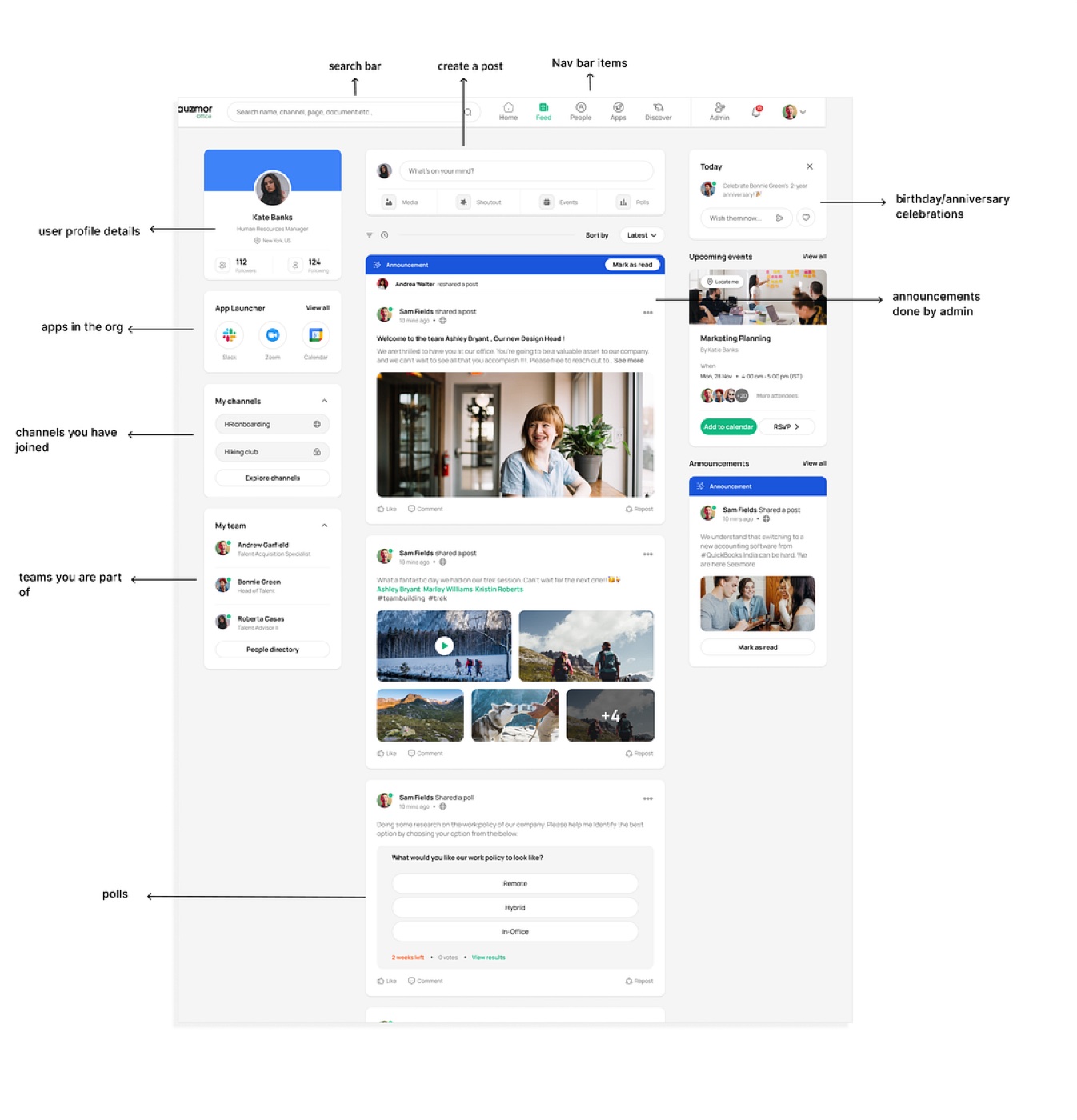
- Role
- Product Designer · Auzmor
- Duration
- Nov 2022 — Mar 2023
- Tools
- Figma, FigJam, Confluence
- Skills
- Wireframing, Prototyping, Web & Mobile, Competitive Analysis
Context
An organization's intranet is a private, internal network for communication and collaboration among employees — a central hub to access company resources and interact. In simple terms: a LinkedIn or Facebook, but exclusively within the organization, so employees stay connected, share information, and work together more effectively.
About Auzmor
Auzmor is an HR SaaS company focused on employee training, recruitment, and employee experience, built around three core products — Auzmor Office, Auzmor Learn, and Auzmor Hire. Through these, Auzmor helps organizations foster growth, improve engagement, and drive better outcomes.
Projects I worked on
- Creating an MVP for Employee Experience
- Creating channels and documents
- Building the LXP — a merger of Auzmor Learn and Office
Project 1: An MVP for Employee Experience
This product lets employees engage at a deeper level, intertwined with meaningful communication.
My role
My role was to create an MVP and ship it. Along with one other designer, I ran the research, wireframes, and stakeholder prototypes, the UI design, feedback rounds, regular syncs with the PM, and dev handoff.
Design process
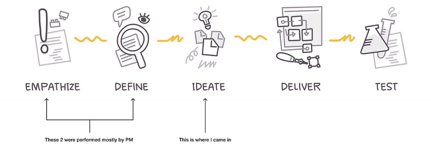
Define
Problem statement
Employees needed a more engaging, effective way to communicate and interact through the company's internal platforms. Existing tools were fragmented and didn't fully support meaningful communication or collaboration.
The challenge: build Auzmor's intranet to enhance employee engagement — a more cohesive, intuitive experience that enables deeper interactions and better collaboration.
Ideation
I started by reviewing the data the Product Manager had already gathered, which gave initial insight into user needs and challenges. From there I moved into ideation — additional research to build on those insights and refine our ideas, so the solutions were well-informed and effective.
Competitor analysis
There are many intranet applications with overlapping features. To understand how they work and find common patterns, I ran a thorough competitor analysis — examining key functionalities, evaluating UI patterns, and getting a sense of industry standards.
The analysis surfaced some clear findings:
- Lack of intuitive design — the goal isn't always to make something totally new, but to keep it familiar and easy to use. Some products were too complex, leading to poor experiences.
- Outdated UI — some had cluttered, dated designs; we wanted something familiar yet fresh and minimal.
- Positives worth keeping — effective collaboration tools (messaging, spaces), mobile availability, and an engaging news feed.
Using these insights, I focused Auzmor's intranet on the shortcomings — which also shaped the release plan and clarified what to build for the MVP.
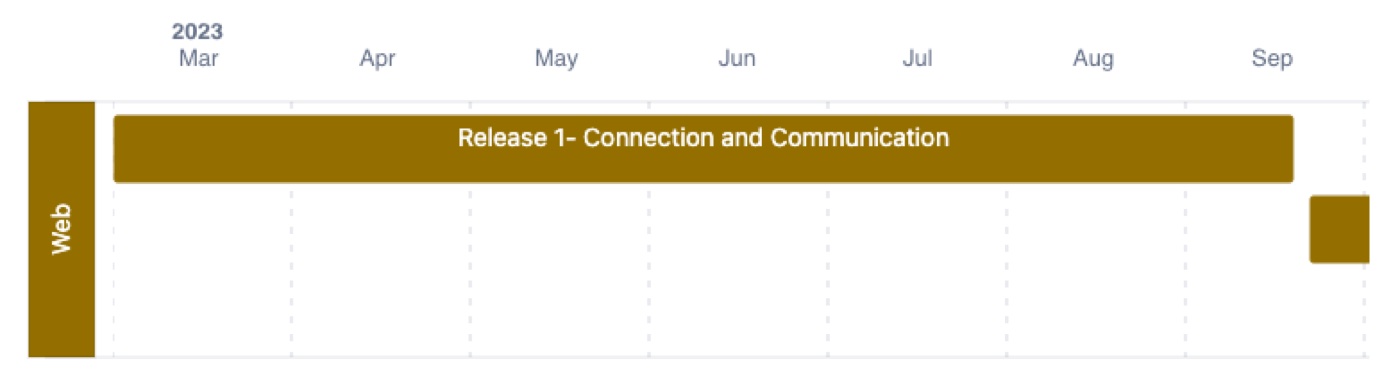
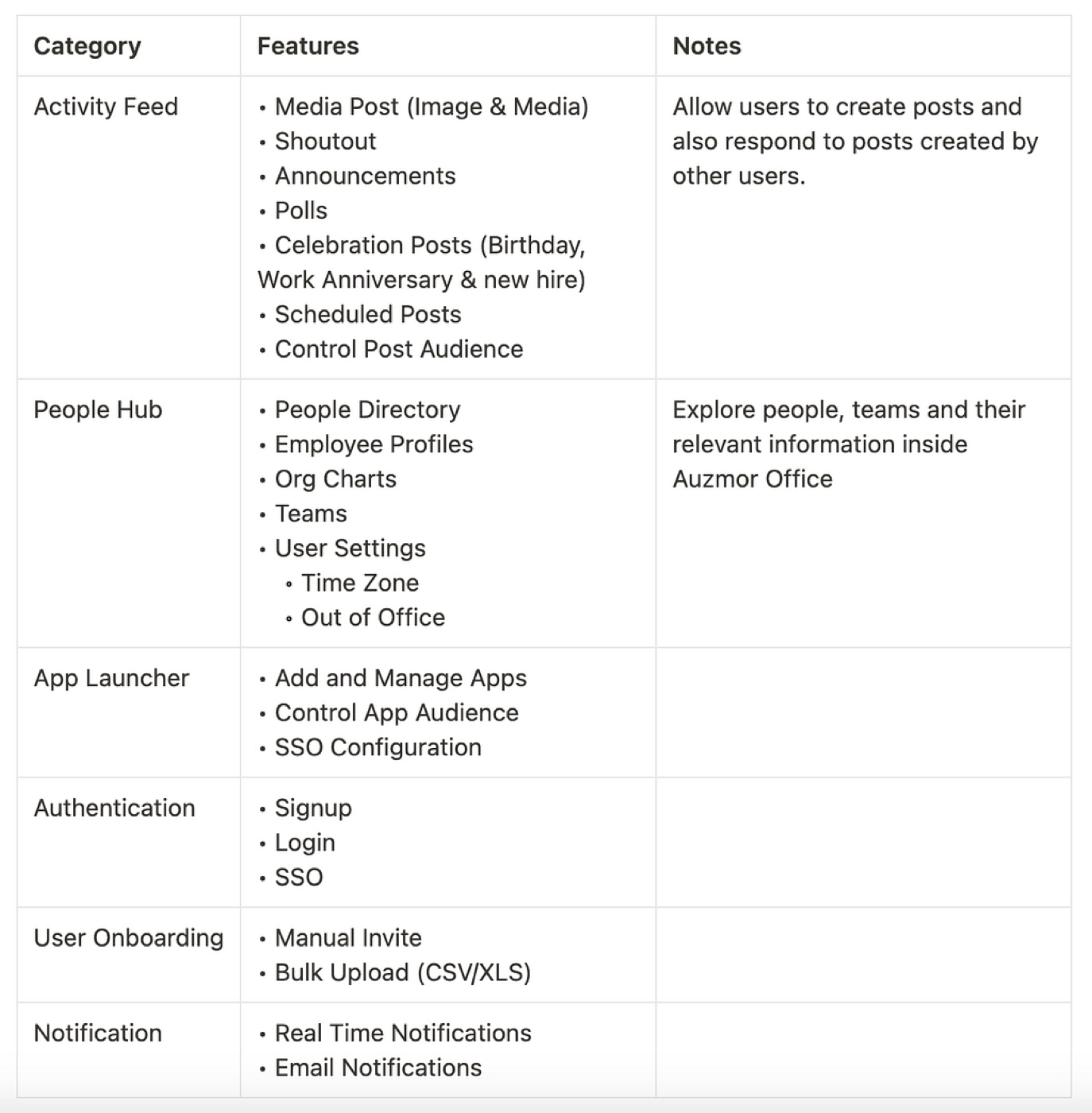
Release 1 — Connection & communication
Based on requirements from the sales team, stakeholders, and potential clients, we made a release plan of the components and functionality to ship first.
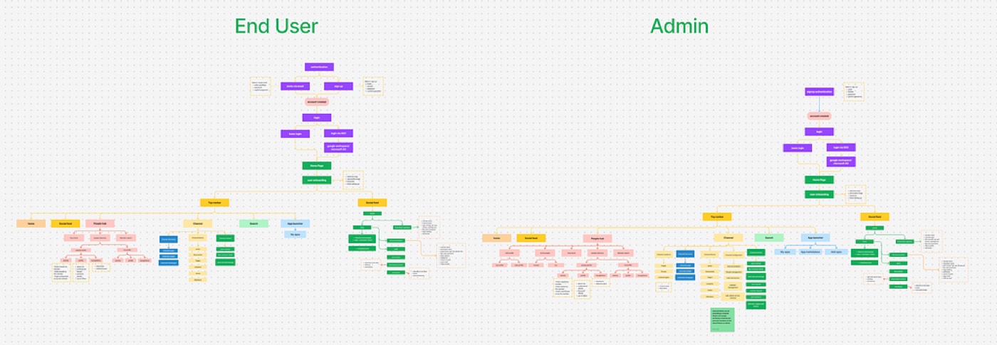
Information architecture
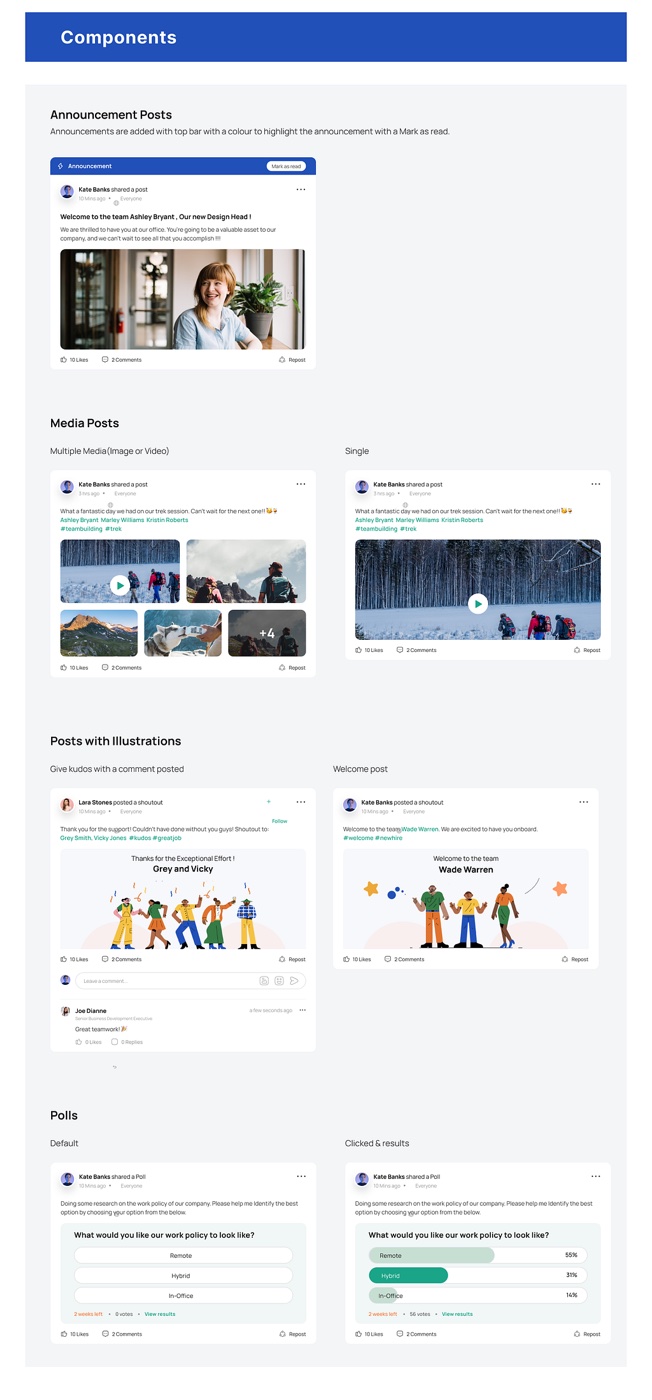
Visual direction
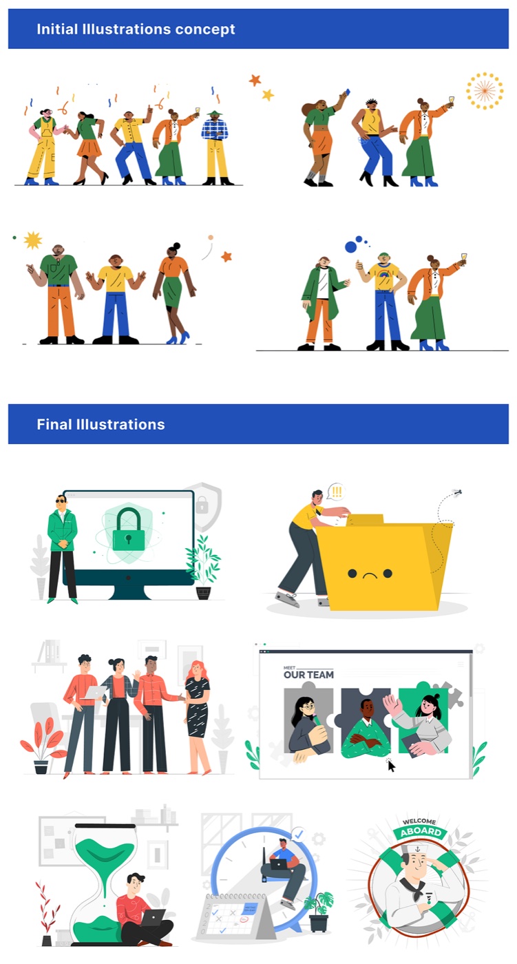
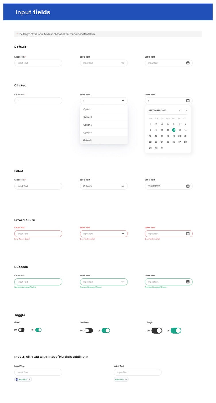
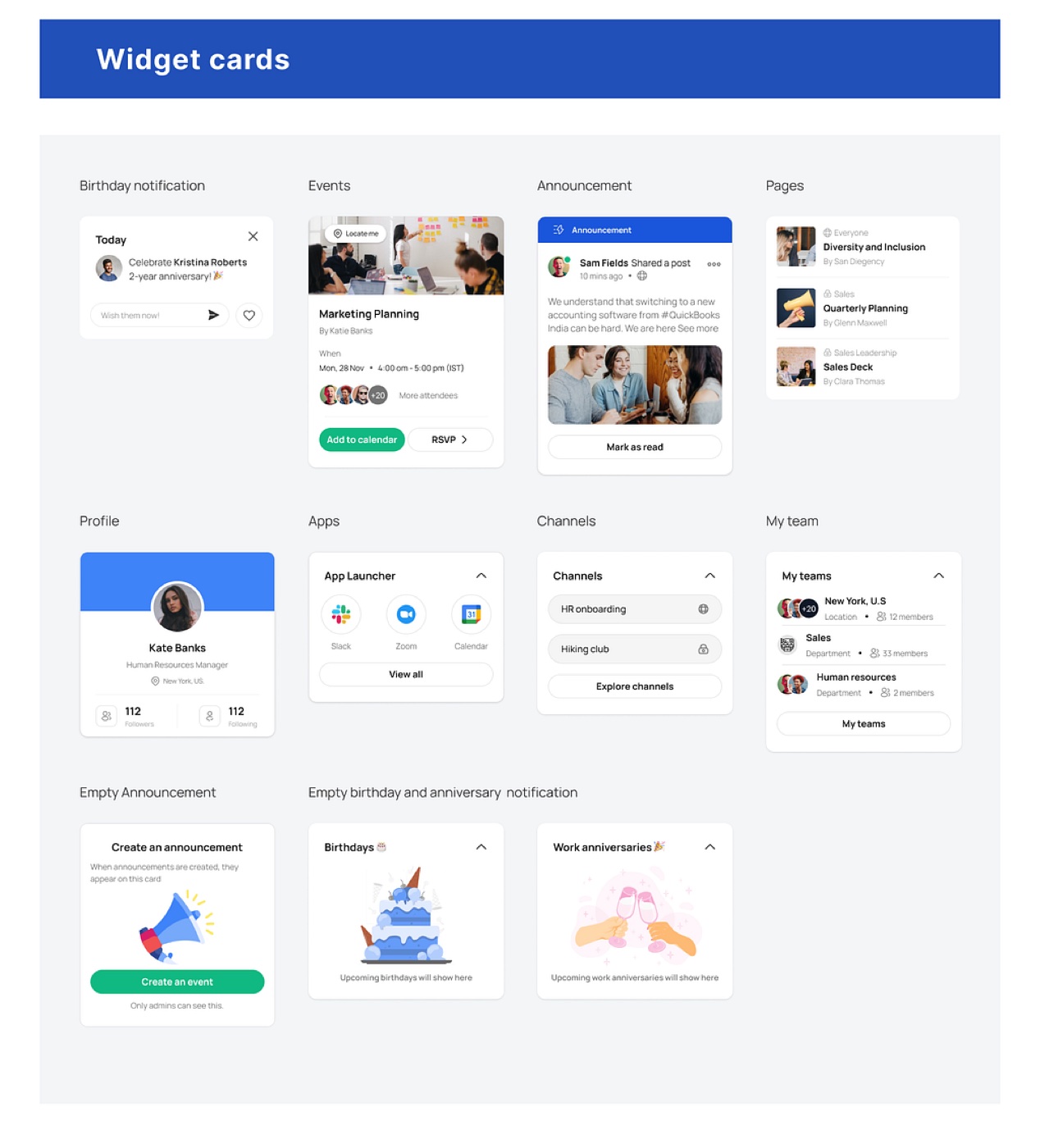
The goal was a clean, modern, user-friendly interface. We ran multiple stakeholder meetings and extensive internal testing so it was not just aesthetic but intuitive and well received. For instance, we first chose illustrations from Designstripe, but the team felt they were too linear and flat — so we switched to more dynamic, engaging illustrations from Storyset, which landed much better.
Initial concepts
With the problem clearly defined, we focused on the homepage — the first page a user sees on login, and a chance to set the product's design language. The goal: a user-centric homepage that surfaces essential metrics and workflows.
Concept 1
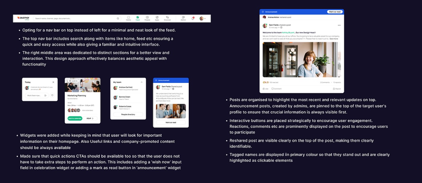
As a content-heavy intranet, I designed a two-column layout to ease the content and progressively reveal the rest — posts on the left, widgets on the right. I used a left + top navigation: the left nav (with apps) is easily scannable for fast navigation, while the top nav holds the most important, accessible features — home, discover, apps, and search.
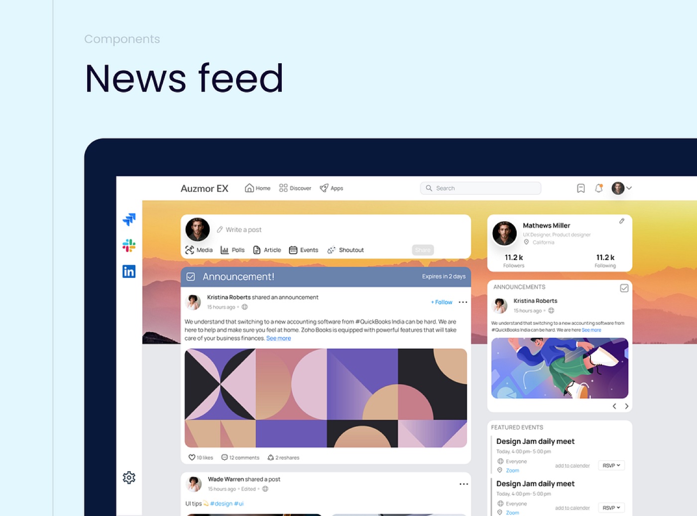
Feedback: the design was well received for its modern, appealing look — but a more central layout could better match the natural movement of the eye, for faster processing and less cognitive load.
Concept 2
I introduced a three-column layout — widgets split left and right, feed in the middle — which meant a top nav (a left nav would feel crowded and distract from the newsfeed).
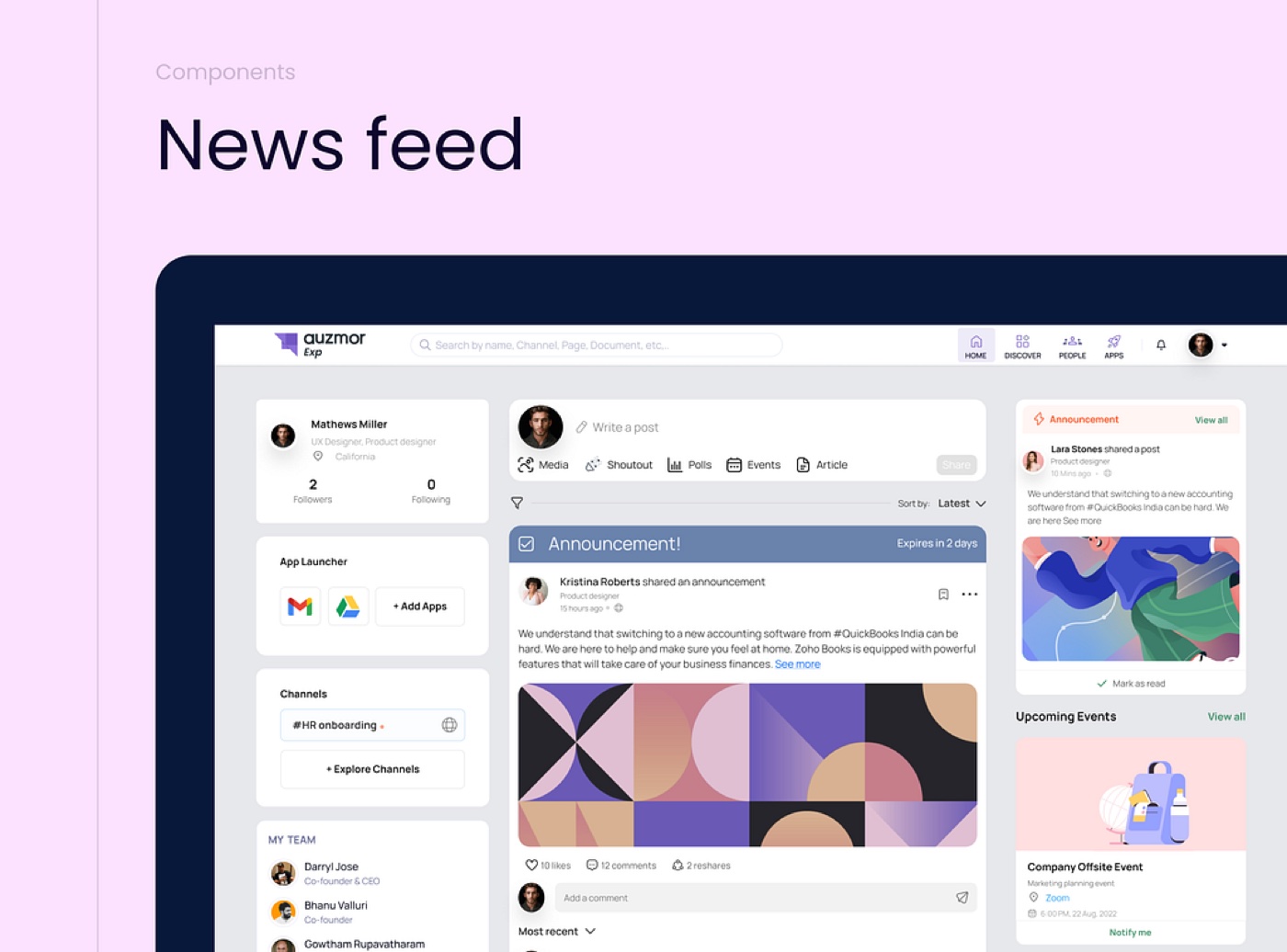
Feedback: the three-column layout hit the mark. They liked personal information on the left and other widgets on the right. This let us finalize the direction and move into development.
Wireframing
Home page & people-hub components
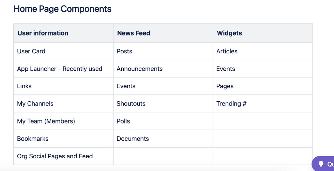
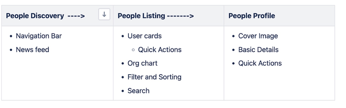
The homepage and people-hub components and widgets were largely based on the competitor analysis, the initial concepts, and the IA from research.
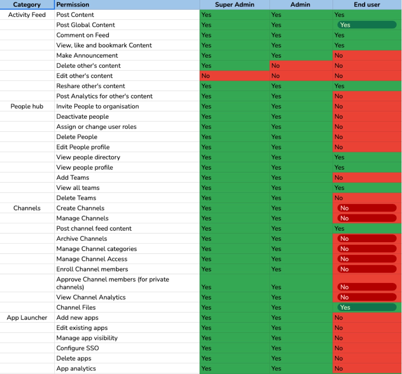
This maps three user types — super admin, admin, and end user — detailing the actions each role can perform and the permissions assigned to each.
Final designs
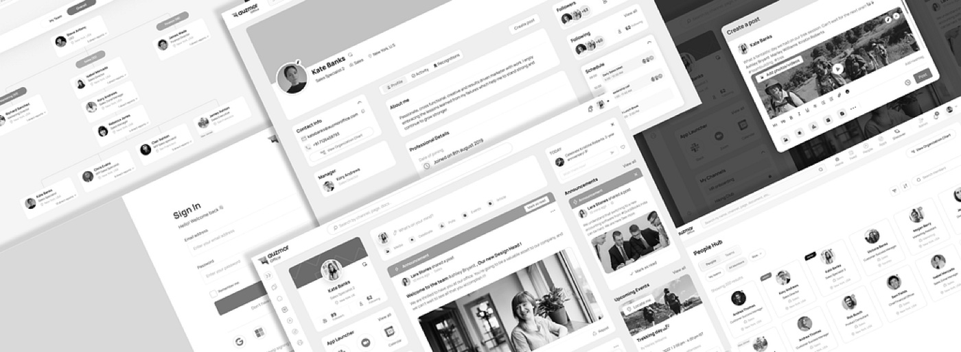
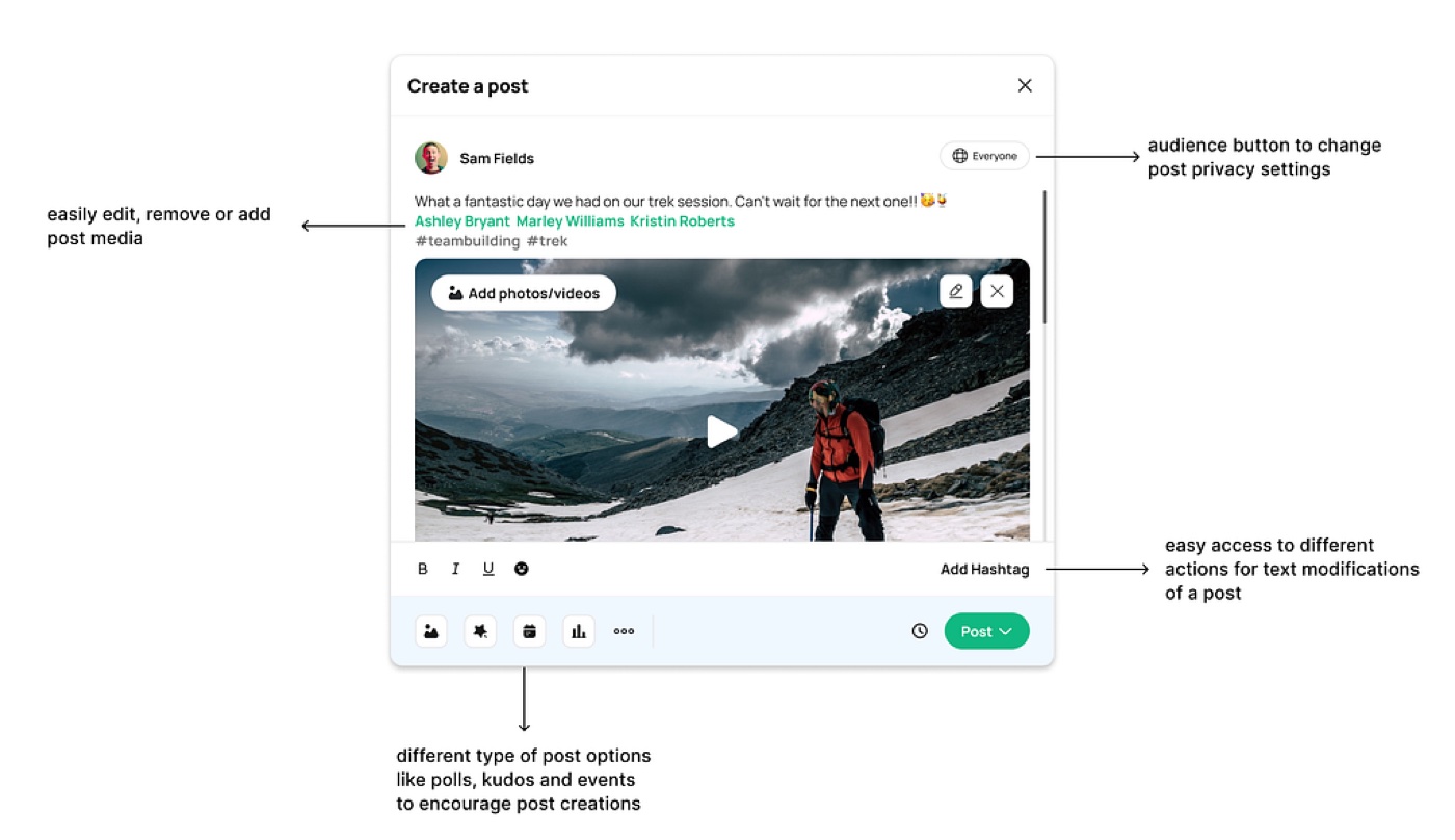
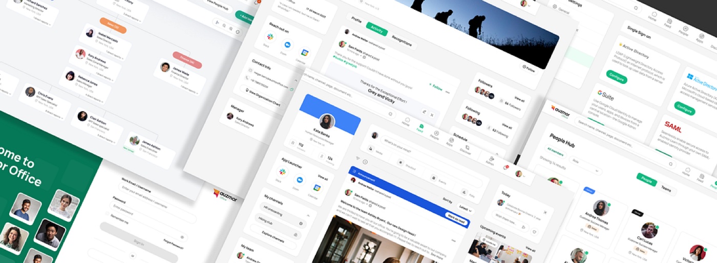
After feedback and refinement of the initial concepts, we built the final designs for the homepage, people hub, apps, and more.
News feed
People Hub — design & iterations
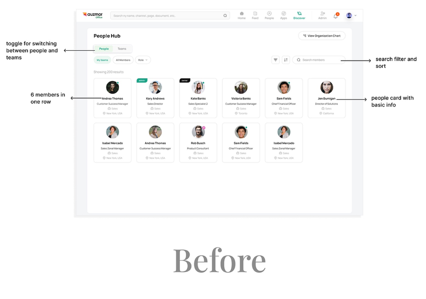
The people hub shows people cards listing everyone in the organization, with a toggle between People Hub, Teams Hub, and an org-chart view. Clicking a card opens that member's profile.
Feedback: the functionality was appreciated, but there was room to improve — space at the top was wasted on buttons, and six cards per row felt cluttered.
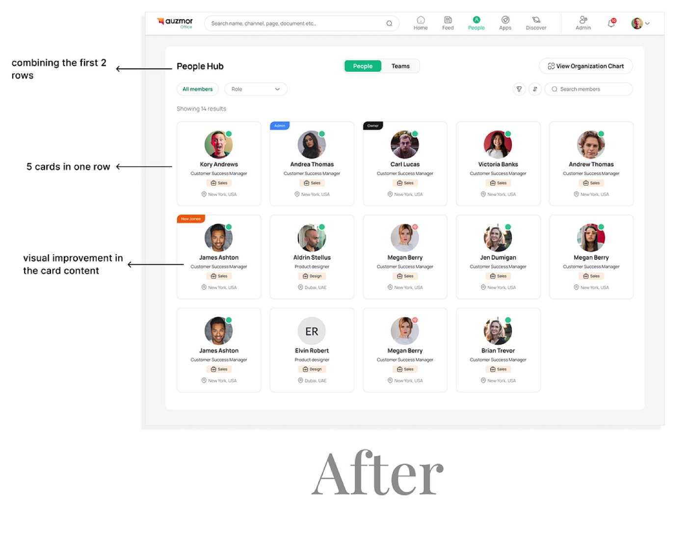
To address it, we combined the first two rows to use the space better and reduced the row from six cards to five, made it responsive so the count adjusts to screen size, and improved the text hierarchy inside the cards so the information reads clearly.
Prototyping
I built prototypes from the initial designs — for the sales team and the official Auzmor website.
Feedback
Showcasing the prototypes to potential customers and stakeholders drew overwhelmingly positive feedback:
- Users appreciated the intuitive design and liked its resemblance to LinkedIn, which made the interface familiar and easy to navigate.
- Where market products tend to be complex, they liked Auzmor Office's minimal, clean, user-friendly design.
- We saw an uptick in customer conversion after showcasing prototypes — they became a centrepiece of potential-customer calls.
Stakeholders were also curious about the product's future — channels, onboarding, documents — and keen to see how they'd be added, showing confidence in Auzmor Office's ability to grow.
More from release 1
Learnings
- Responsive-first — I used to not think much about how designs translate across screens. Building our design system and the mobile app taught me the importance of responsive design.
- Get feedback early, not just at handoff — it surfaces real-world constraints and helps you adapt. And a harder lesson: don't take your designs personally — you have to accept constructive criticism to grow.
Other projects at Auzmor
- Creating the channels and documents section
- Building the LXP — a merger of Auzmor Learn and Office
- Creating the design system for Auzmor Office
- The mobile app for Auzmor Office