2025 · Product Designer · Mosaic Wellness
Redesigning the Be Bodywise sunscreen PDP
Rebuilt the sunscreen product page around trust, social proof, and a mobile-first hierarchy — lifting add-to-cart conversion by 3.3%.
+3.3%
conversion lift
2
variants A/B tested
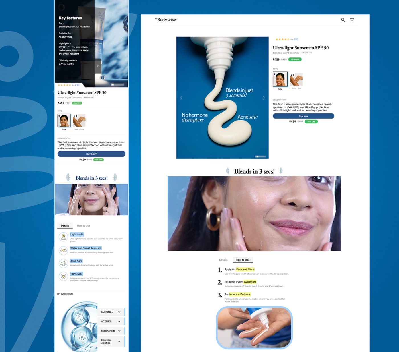
- Role
- Product Designer
- Timeline
- March 2025
- Tools
- Figma, Webflow, Mixpanel
Project overview
Redesign Be Bodywise's sunscreen PDP to increase conversions by simplifying information, building trust, and adding social proof — all while keeping engineering effort minimal.
The problem
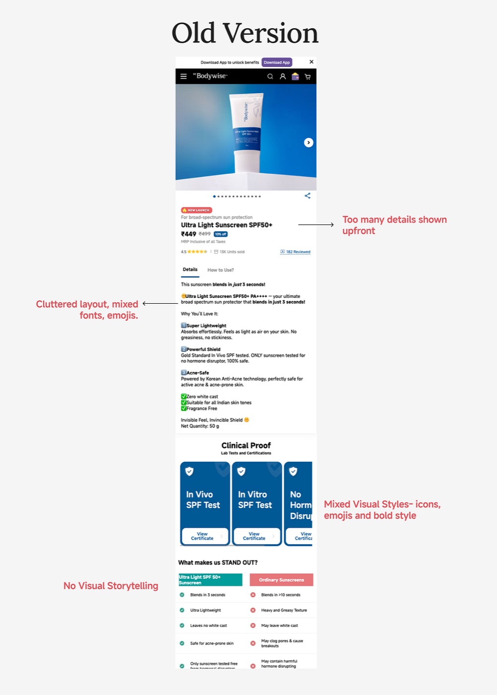
The original Be Bodywise product display page wasn't creating enough product conviction or conversion. The challenge was to reimagine the PDP to address decision fatigue and build stronger emotional connections with target personas — ultimately driving measurable conversion improvements.
Understanding our users
Before designing, I referred to Be Bodywise's core user personas to make sure the PDP resonated with real users.
Active users
Health-conscious women who frequently explore new wellness products.
- Want fast conviction and visible product benefits.
- Respond well to clear offers and easy purchase flows.
Inactive users
Women who have purchased before but lost engagement.
- Need reasons to return.
- Sensitive to clutter or overwhelming layouts.
Skeptic users
Women curious about wellness but hesitant due to trust concerns.
- Need proof: social validation, science-backed results, low-risk ways to try products.
Mixpanel data
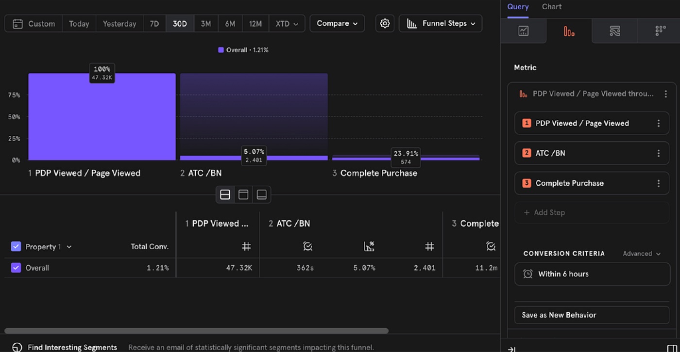
Out of 47K visitors, only 5% added the product to cart.
Users might have faced decision fatigue due to:
- Overwhelming information density.
- Mixed typography and visuals.
- Lack of trust cues and clear product conviction.
- A page that failed to connect emotionally with the target user.
To get more insight, we ran user-calling sessions.
UX goals
- Create FOMO & urgency — highlight limited stock, high demand, and social proof.
- Instant conviction — convince users within seconds why this sunscreen is a must-have.
- Seamless decision-making — reduce cognitive load with clear benefits, visuals, and comparisons.
- Mobile-first & fast — prioritize speed, lightweight visuals, and easy interaction.
- Visual delight & trust — showcase the ultralight texture with immersive shots and real-user proof.
User research
We ran A/B testing comparing the Be Bodywise India and Dubai PDPs, to identify the elements that would drive conversion and build a stronger emotional connection with our audience.
1 · Hero section
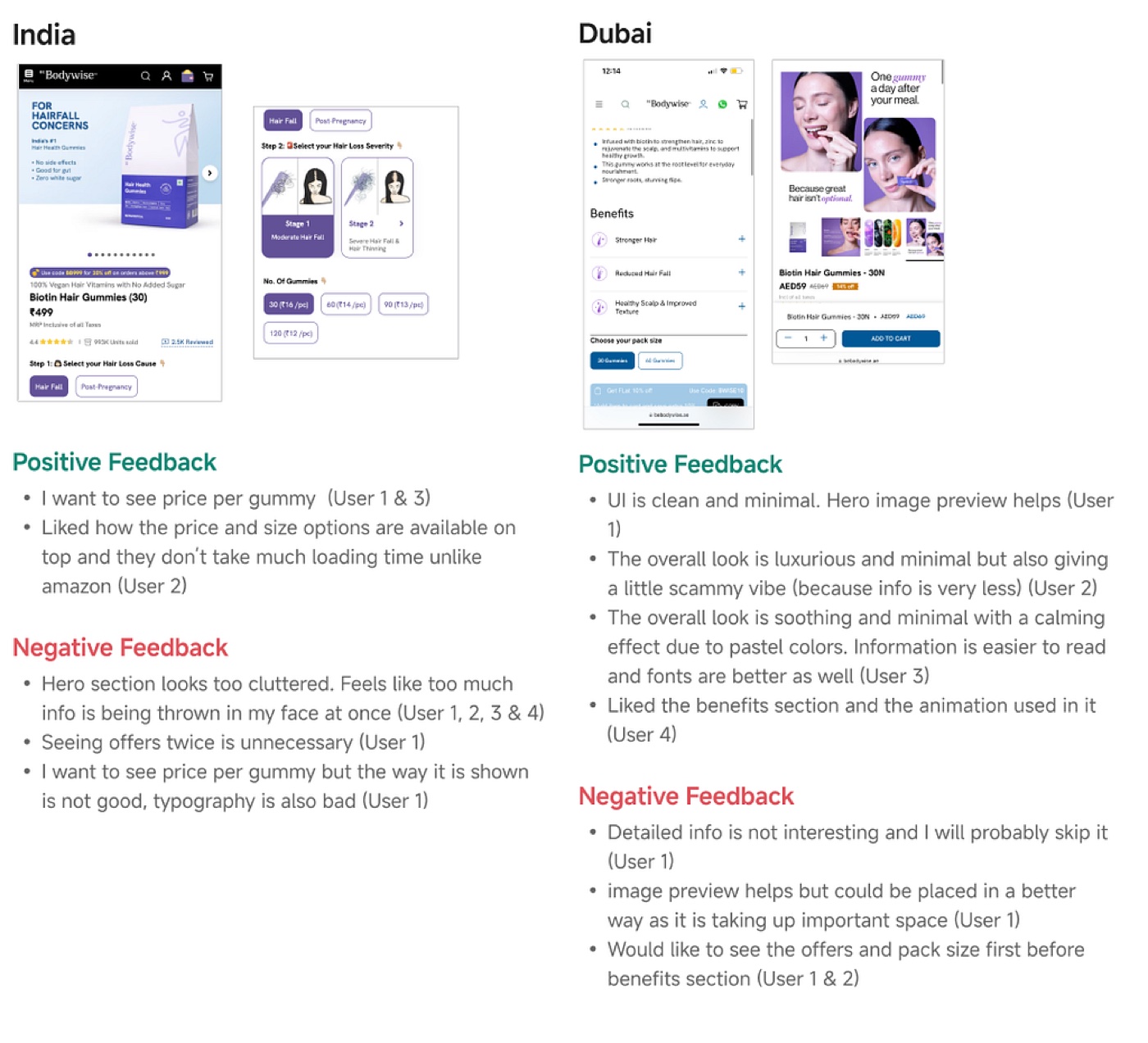
The India page showed price and size options upfront, which users liked — but it felt crowded and messy, with too much text and poor typography. The Dubai page looked cleaner and more premium, but hid key info like price and offers under less important sections.
What users want: a page that combines India's useful layout (price, size, offers at the top) with Dubai's neat, simple design.
2 · Hero section images
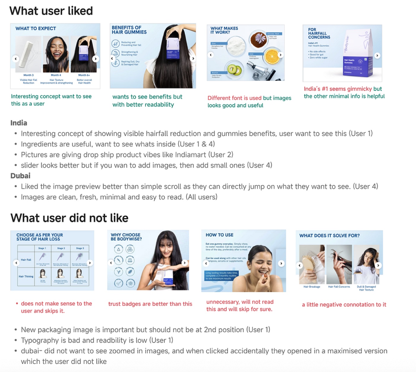
India felt informative but cluttered — too many images and mixed styles. Dubai had a clean, minimal vibe, and its photo carousel worked better.
What users want: to see offers, benefits, and product info first. Only 5–6 images are enough, and sections like 'How to Use' were skipped when they weren't seen as useful.
3 · Details section
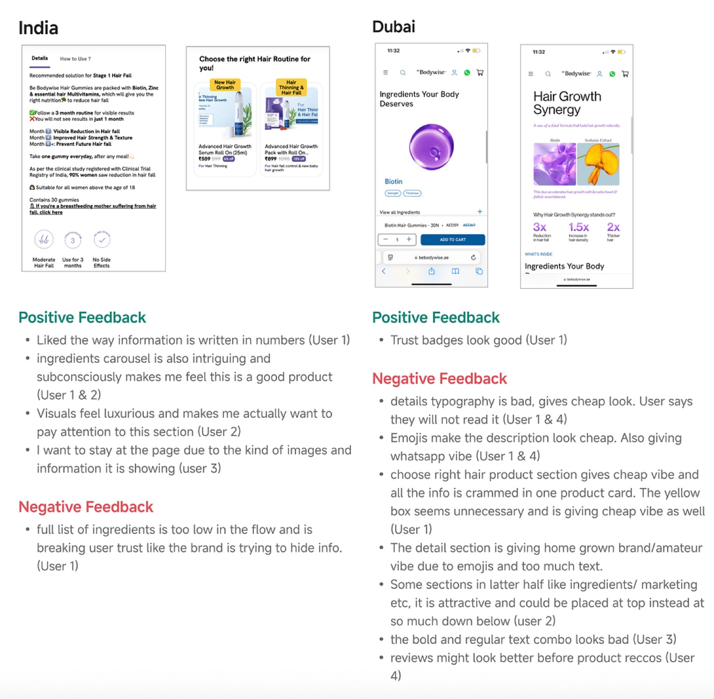
India suffered from poor typography, emojis, and a cluttered layout that felt less trustworthy. Dubai looked cleaner and more premium, with effective numbers, visuals, and layout.
What users want: concise, visually engaging information upfront; ingredients and key benefits shown early to build trust; and a focus on clarity and hierarchy over anything that feels 'homemade' or over-explained.
4 · Reviews & FAQs section
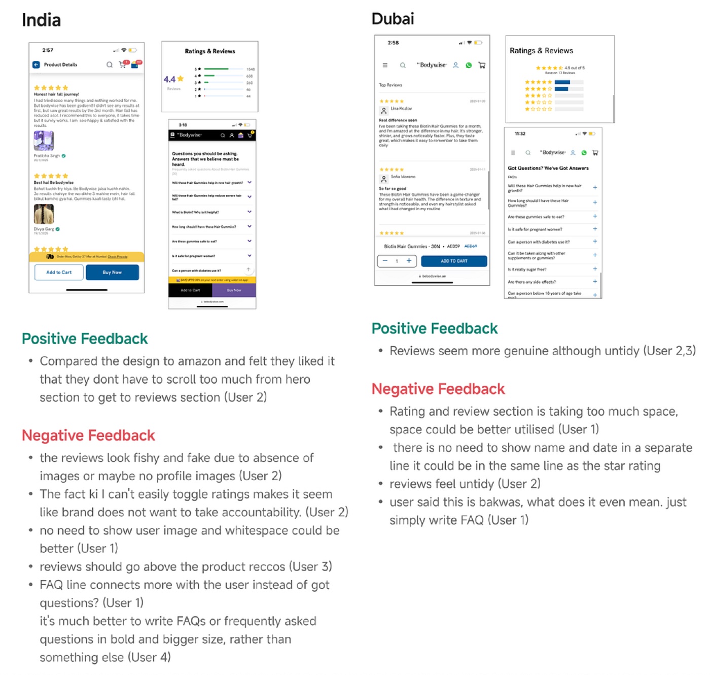
Dubai's layout was better structured — reviews appeared early — but their authenticity was questionable without profile data or filters. India's reviews felt more genuine but lacked polish. In both, the FAQ needed clearer headings, larger fonts, and no gimmicky language.
What users want: trustworthy-looking reviews with credibility cues, a less cluttered, skimmable layout, and clear, user-minded FAQ headings.
Key insights from user calling
India variant
- Shows important info like price, offers, and ingredients upfront — which users liked.
- But it feels cluttered, with poor typography and inconsistent images.
- Emojis and long text make it feel less professional and harder to trust.
Dubai variant
- Feels more minimal, clean, and premium, with better image quality and early review visibility.
- Users liked the carousel format and how reviews show up early.
- But offers and ingredients are hidden below, which made some users lose trust.
- Reviews look less real because there are no images.
What users want
- A hybrid layout: Dubai's neat design + India's upfront product info.
- Just 5–6 good images — too many can distract.
- A readable, skimmable layout with clear hierarchy and consistent fonts.
- Sections like 'How to Use' reimagined — users skipped them when misplaced or text-heavy.
- Reviews that feel real and trustworthy.
- Clear, easy-to-scan FAQs — big, bold headings, no playful language.
Framework for the redesign
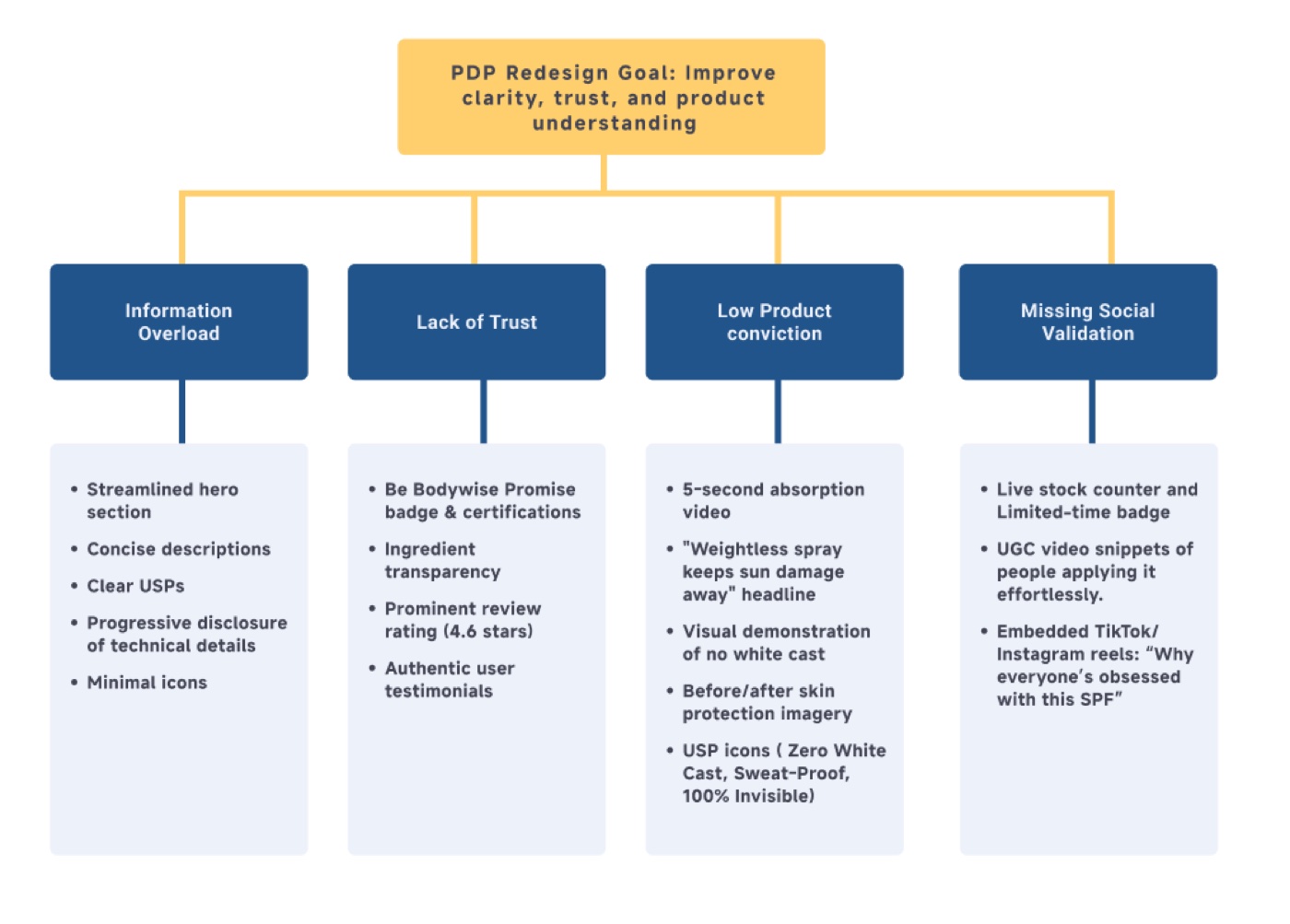
Across our conversations and analysis, we found four issues stopping people from buying: too much information, lack of trust, uncertainty about how the product works, and missing social proof.
We built a roadmap that pairs each issue with a specific solution — so every new element on the page has a clear purpose, making it easier for customers to understand the product and feel confident buying it.
PDP structure
Hero section
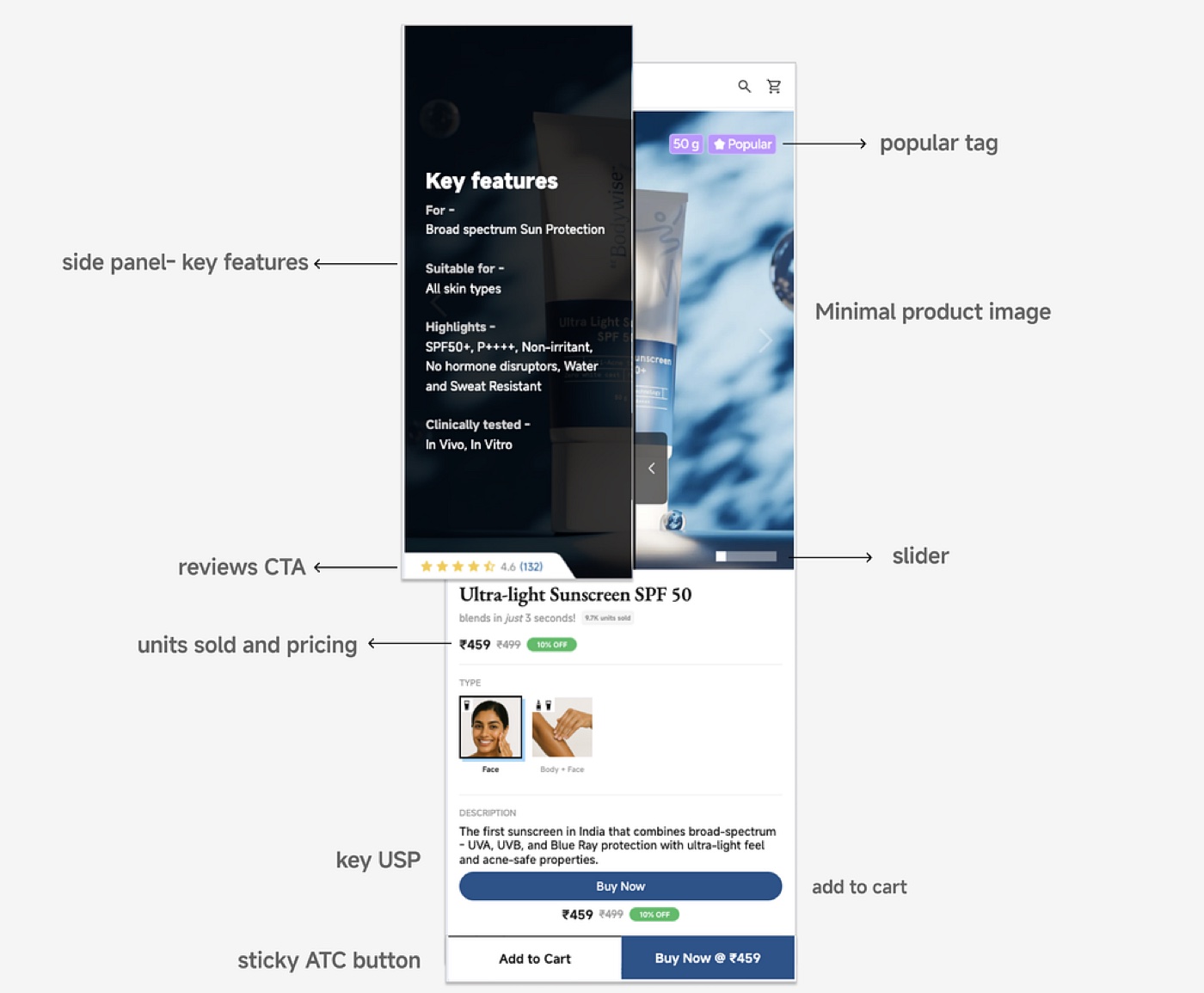
- Side panel with key features — shows benefits (SPF rating, skin-type fit) with progressive disclosure to avoid overload.
- Popular tag & units sold — adds social proof and reassures on credibility.
- Clear product imagery — clean visuals keep focus on the product and its benefits.
- Image slider — signals how many images are available without overwhelming the hero.
- First-fold pricing & offers — price and discounts upfront for quicker decisions.
- Key USP callout — highlights unique benefits (e.g. blends in 3 seconds) to build conviction.
- Sticky add-to-cart — quick action, minimal purchase friction.
Product images
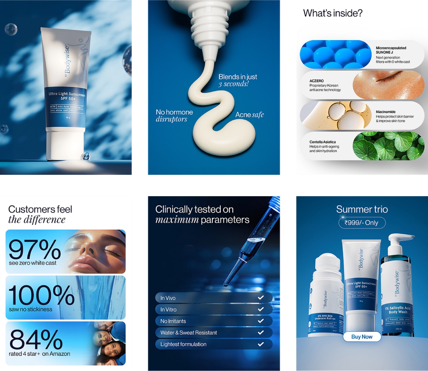
We developed new product visuals that are clearer, more engaging, and more purpose-driven than the old PDP.
- Hero shots — from plain packshots to high-quality images with refined lighting for a premium, trustworthy feel.
- Product demos — close-up shots of the sunscreen flowing, so users can visualize its texture.
- Ingredients breakdown — clean infographics instead of long, hard-to-scan text lists.
- User proof — bold infographics with stats like '97% saw zero white cast', making trust visible at a glance.
- Bundle promotions — unified shots for bundles like the 'Summer Trio' to lift order value.
These updates make the PDP more visually engaging, easier to understand, and significantly more trustworthy.
Details & ingredients
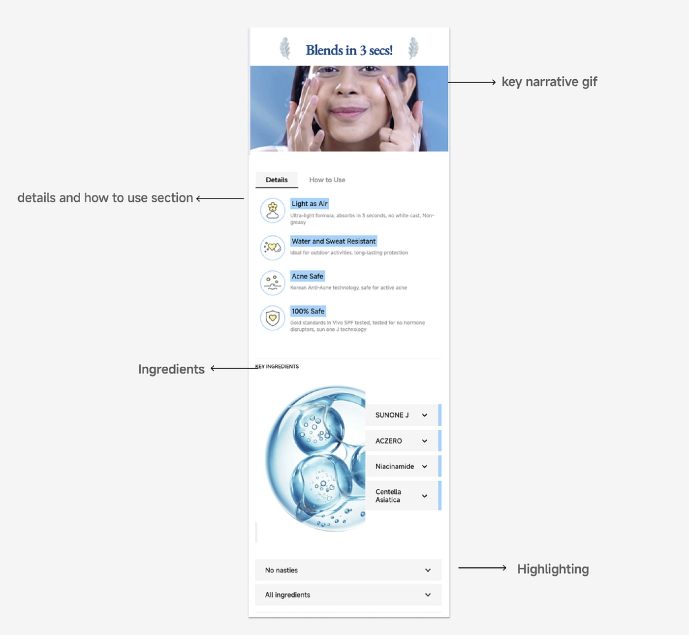
- Narrative GIF — a quick clip of the sunscreen blending in 3 seconds, so users grasp performance instantly.
- Details & How to Use — a concise description, with 'How to Use' split into its own tab to cut clutter.
- Ingredients — transparency for trust building, with minimal, clean UI.
- 'No Nasties' — a dedicated section listing what the product doesn't contain, to reassure cautious users.
Reviews & FAQs
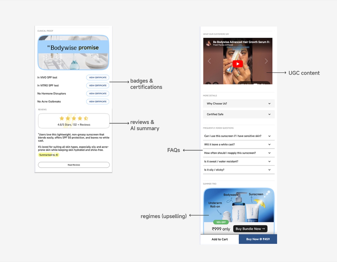
- Badges & certifications — clinical proof (In-Vivo / In-Vitro SPF tests) that builds credibility for skeptics.
- Reviews & AI summary — star ratings and a summary so users grasp real experiences fast.
- UGC — embedded user videos and real customer stories for authentic social proof.
- FAQs — common questions answered in a clean, collapsible format.
- Regimes — bundle suggestions to raise cart value.
Before & after
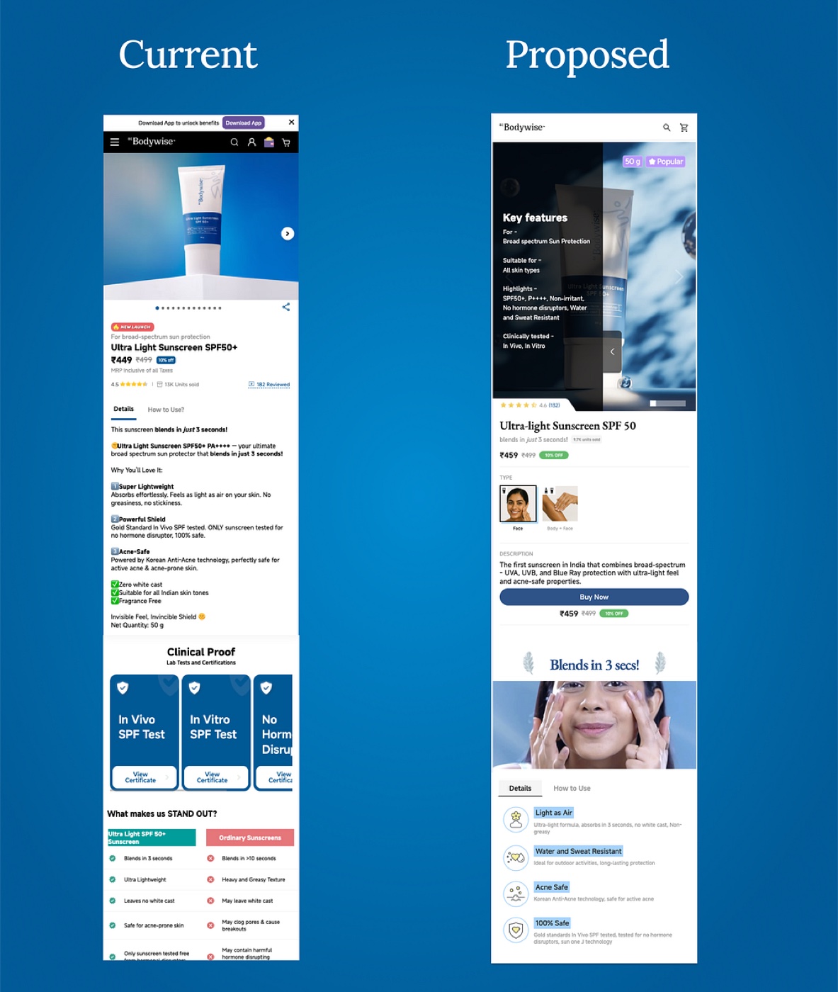
The original PDP was text-heavy and cluttered with mixed fonts, emojis, and dense blocks of information — users felt overwhelmed and struggled to find key details. The new design is clearer, faster to navigate, and tailored to diverse user needs, improving both trust and likelihood of conversion.
The result
After building and testing the redesign as Webflow prototypes, we achieved a +3.3% lift in conversions on the Be Bodywise sunscreen page. Usability tests and stakeholder feedback also showed:
- Users found the new layout clearer and less overwhelming.
- Trust signals — badges, UGC, clean visuals — increased perceived credibility.
- The hybrid layout balanced detailed product info with a clean, premium design.
Off the back of these results, we're rolling these elements out to other PDPs to further improve site performance and trust.
Key learnings
- Visual hierarchy matters most — users respond strongly to clean, organized IA.
- Show, don't tell — a 5-second video created more conviction than paragraphs of text.
- Social validation is critical — real numbers (9.8K units sold) and authentic reviews beat marketing claims.
- Mobile-first pays off — optimizing for mobile first meant a better experience on every device.